Great app design isn't about trends — it's about ergonomics, typography hierarchy, and habit loops that keep users coming back. Here's how intentional design drives long-term retention.
Core Principles of Creative Mobile App Design That Drive Retention
Creating a memorable app requires more than just picking attractive fonts and trendy drop shadows. Intentional creative mobile app design bridges the gap between pure artistic expression and raw functional utility. Every pixel, margin, and animation must serve a distinct purpose. When we build products for our clients at Synergy Labs, we ground our design language in behavioral science to ensure users feel instantly comfortable while remaining deeply engaged.
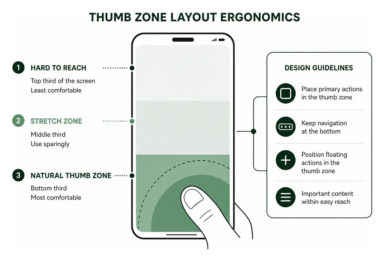
A fundamental pillar of retention-focused design is human ergonomics, specifically thumb zone navigation. Most users operate smartphones single-handedly. By placing primary interactive elements—such as bottom navigation tabs, primary calls-to-action, and floating action buttons—within the bottom third of the screen, we reduce physical strain and make interface navigation second nature.
Typography hierarchy plays an equally critical role. Mobile screens afford limited space; overloading users with varied font weights, sizing, and decorative typefaces creates immediate cognitive fatigue. Professional interfaces rely on strict typographic scales—typically limiting a design system to a maximum of four font sizes and two font weights. This disciplined structure allows users to scan information effortlessly, understanding what is actionable and what is informative within milliseconds.
Furthermore, integrating habit loops into mobile interfaces turns casual opens into daily routines. By combining clear triggers, seamless action flows, variable rewards, and immediate user investment, apps can create self-reinforcing engagement. For a deeper dive into crafting user-focused journeys, read our guide on User-Centered Mobile App Design.
Mastering Color and Layout Grid Systems in Creative Mobile App Design
To achieve visual harmony without overwhelming the user, professional UI designers follow mathematical systems for layout and color distribution. Randomly selecting primary colors or eyeballing margins quickly leads to chaotic, amateur interfaces.
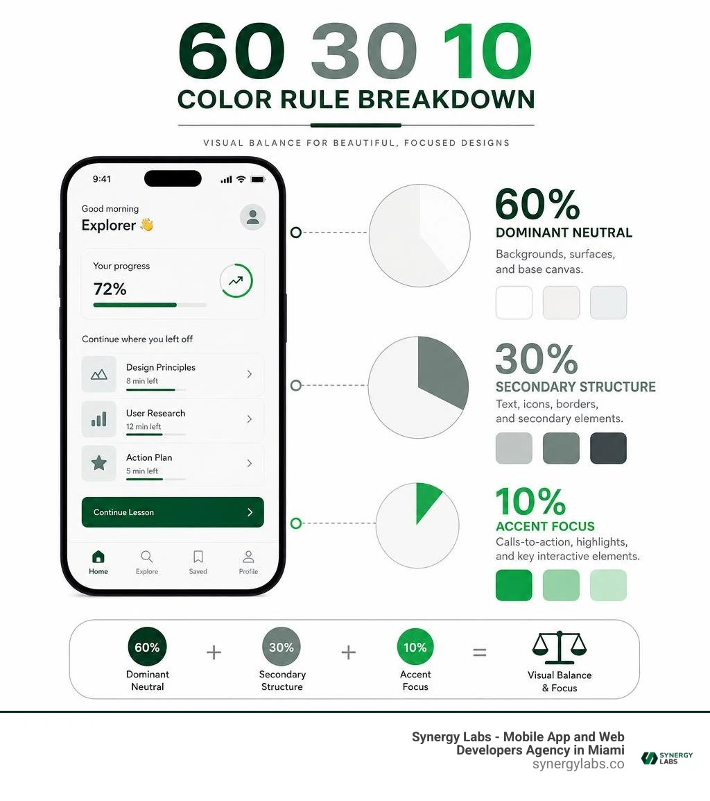
The 60/30/10 color rule provides a reliable framework for visual balance:
60% Dominant Neutral: Used for structural backgrounds, card fills, and base canvas areas (light grey, off-white, or deep dark mode tones).
30% Secondary Structure: Used for text hierarchy, sub-headers, borders, cards, and secondary UI components.
10% Accent Focus: Reserved strictly for high-priority elements like primary action buttons, key toggle states, and progress indicators.
Alongside color distribution, spacing consistency is mandatory. By using an 8-point grid system, every margin, padding, icon container, and line height is a multiple of 8 (or 4 for smaller sub-components). This grid ensures mathematical alignment across varying mobile screen densities, eliminating subtle misalignments that sub-consciously make an app feel unpolished. For technical rules and open-source references on applying these grid frameworks, explore the code patterns in digitaleflex/mobile-app-ui-design.
Designing Frictionless Flows and Micro-Interactions
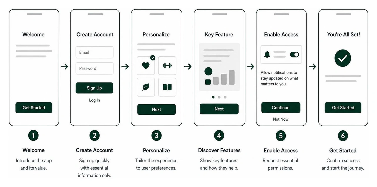
First impressions happen fast in the app ecosystem. Users decide whether to keep an app within 3 seconds, making onboarding the single most critical flow in your product. Smooth onboarding patterns reduce immediate drop-offs by showing utility before demanding effort.
However, frictionless design doesn't mean removing all friction entirely. Sometimes adding calculated, deliberate steps improves the user experience. Learn more about how strategic design delays enhance security and user confidence in our article on Purposeful Friction: Why Creating Habit-Forming Apps Demands Behavior-Driven Design.
Micro-interactions—like a subtle haptic feedback vibration when toggling a switch, or a smooth spring animation when pulling to refresh—give mobile applications physical tactile quality. These slight motion cues provide clear confirmation of user input while injecting personality into routine interactions.
50+ Real-World Inspiration Examples Across Core Industries
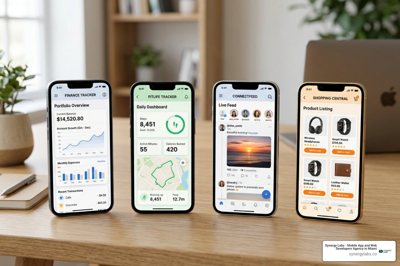
When seeking inspiration for creative mobile app design, inspecting live, production-grade applications yields far better results than looking at non-functional visual concepts. Design reference platforms index over 1,000 real apps with hundreds of thousands of screens and user flows, showcasing how top companies solve real UX problems. Community resources on Figma also offer powerful prototyping kits with tens of thousands of downloads to kickstart layout exploration.
Fintech and Digital Wallet Interfaces
Modern financial applications must balance complex numerical data with pristine visual clarity to establish immediate user trust.
Dark-Mode Portfolio Trackers: Utilizing deep charcoal backgrounds with high-contrast accent greens and reds for immediate visual status recognition.
Biometric Authorization Screens: Sleek, single-action overlays with subtle lock-to-unlock animations.
Card Swap Carousels: Interactive physical card stacks that slide smoothly across the primary viewport using subtle gesture physics.
Expense Breakdown Donuts: Micro-animated charts that expand details upon user contact.
Quick-Send Contact Lists: Horizontal avatar rings located directly in the thumb zone for rapid peer-to-peer payments.
Crypto Asset Detail Dashboards: Minimalist sparkline charts stripped of unnecessary gridlines to focus purely on visual trend direction.
Simplified Budget Meters: Color-coded progress bars shifting from soft blue to warning orange as spending thresholds approach.
Automated Savings Vault Containers: Visual visual progress jars that animate when spare-change deposits drop in.
Transaction Receipt Sheets: Bottom-anchored modal sheets displaying merchant logos, geographic tags, and downloadable PDF triggers.
Health, Wellness, and Habit Tracking Concepts
Wellness applications leverage atmospheric motion, soft color tones, and clear progress tracking to keep users calm and motivated.
Mindfulness Meditation Timers: Minimal layouts paired with subtle atmospheric background gradient shifts that pulsate in rhythm with breathing exercises.
Hardware Bluetooth Pairing Hubs: Step-by-step visual connection guides with radar wave animations indicating searching states.
Flight Booking Itinerary Timelines: Vertical flight status cards using clean typography to separate layovers, me-time gates, and baggage claim updates.
E-Commerce Flower Shops: Clean product grids showcasing custom bouquet customizers paired with companion web promotional sites.
Beverage Fast-Delivery Trackers: Live map route overlays tracking delivery couriers with animated icon markers.
Safe Driving Companions: Minimalist dark displays that connect via Bluetooth to vehicle pods, highlighting safety scores and minimizing driver distraction.
Interactive Language Learning: Gamified lesson maps with animated mascot reactions and progress streaks, similar to Duolingo's retention patterns.
Smart Lighting Controllers: Interactive color wheels allowing real-time bulb hue and brightness adjustments.
Recipe & Meal Planners: Swipeable ingredient checklists paired with step-by-step cooking mode displays that prevent screen timeout.
Virtual Closet Outfit Selectors: Drag-and-drop clothing cards for layering outfits over custom avatar outlines.
Podcast Chapter Navigators: Visual waveform scrubbers with embedded chapter markers and instant speed controls.
Interactive Travel Journal Timelines: Map-pinned photo galleries organizing media chronologically by GPS location tags.
Smart Coffee Machine Controllers: Custom brew profile sliders controlling water temperature and extraction duration.
Auction Bidding Dashboards: Real-time counter animations updating live bids with distinct color pulses on status updates.
Augmented Reality Furniture Placement: Camera viewports projecting 3D furniture models into user living spaces with accurate scale grids.
Task Board Kanban Columns: Horizontal swipable columns designed with spacious card margins for one-handed card moves.
E-Book Reader Customizers: Minimal reading canvases with fine-grained typographic controls for margin, kerning, and paper texture.
Audiobook Speed Scrubbers: Circular dial controls replacing traditional sliders for precise playback adjustment.
Plant Care Reminders: Moisture sensor readings presented alongside visual health indicators and schedule alerts.
Smart Home Security Dashboards: Live multi-camera grid feeds with single-tap pan-tilt controls.
Interactive Concert Discovery Maps: Spatial radar views displaying nearby music venues filtered by genre preferences.
Digital Car Key Controllers: Haptic-enabled unlock buttons with real-time vehicle lock status rings.
Personal Expense Splitters: Visual group tab displays showing balance calculations with instant request triggers.
Interactive Art Gallery Guides: Proximity-triggered audio commentary screens with full-bleed high-resolution artwork views.
Weather Forecast Timelines: Atmospheric weather background animations reflecting live local conditions like rain, fog, or sunshine.
Local City Guide Curations: Swipeable photo cards with integrated map direction triggers and local reviews.
Fitness Class Booking Grids: Time slot selection lists featuring live seat selection maps for indoor cycling classes.
AR Night Sky Stargazing Guides: Camera overlays identifying constellations in real-time as users move their devices.
Custom Watch Face Configurator: Live preview displays rendering custom smartwatch layouts prior to syncing.
Voice Note Transcribers: Real-time text generation streams highlighting speaker tags and key phrase summaries.
Leveraging AI Tools and Workflows to Accelerate Creative Mobile App Design
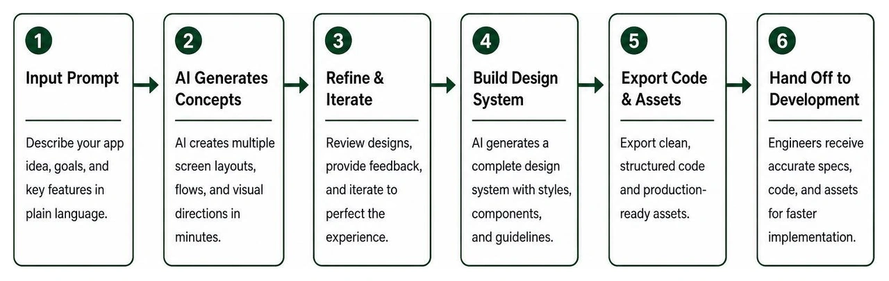
AI tools are transforming how design teams move from concept to execution. Designers no longer spend weeks creating static wireframes in isolation. Modern AI platforms allow teams to input simple plain-English prompts and generate complete multi-screen mobile UI concepts with cohesive visual branding, custom artwork, and structured code frameworks within minutes.
Prompt-driven workflows generate full visual design systems, allowing design teams to test layout hypotheses rapidly before committing engineering resources. Read more about integrating intelligent models into product workflows in our article on Elevating UX with AI: How to Build Emotionally Intelligent Apps.
Bridging Design Concepts and Production Code
Historically, handoffs between designers and software engineers created friction. Visual details like custom shadow radius, padding values, and animation curves were frequently lost during manual translation into code.
Today, advanced generative workflows export production-ready component code directly into native frameworks like SwiftUI, React Native, Jetpack Compose, and Flutter. These design-to-code pipelines maintain absolute fidelity by utilizing shared design tokens for colors, spacing, and typography across platforms. Discover how modern development tools streamline product builds in our guide to Design-Focused Development Platforms 2026.
Avoiding Common Anti-Patterns in Modern App Interfaces
Even creative app concepts will fail if basic usability principles are neglected. When reviewing unfinished or underperforming app projects, we consistently spot recurring design anti-patterns that undermine user experience and retention.
Common design pitfalls include:
Poor Contrast Ratios: Placing low-contrast light grey text on white backgrounds, failing basic accessibility standards and frustrating users in bright sunlight.
Cognitive Overload: Crowding too many buttons, banners, and options onto a single screen without a clear visual focal point.
Unclear Status Feedback: Performing async actions (like submitting payment details) without showing loading indicators or clear state updates.
Inconsistent Navigation Patterns: Mixing bottom navigation tabs with conflicting slide-out side drawers, confusing users about where they are in the application.
Balancing Uniqueness with Usability Standards in Creative Mobile App Design
The desire to create something original often tempts designers to reinvent basic interface elements. However, breaking standard interaction conventions creates unnecessary friction.
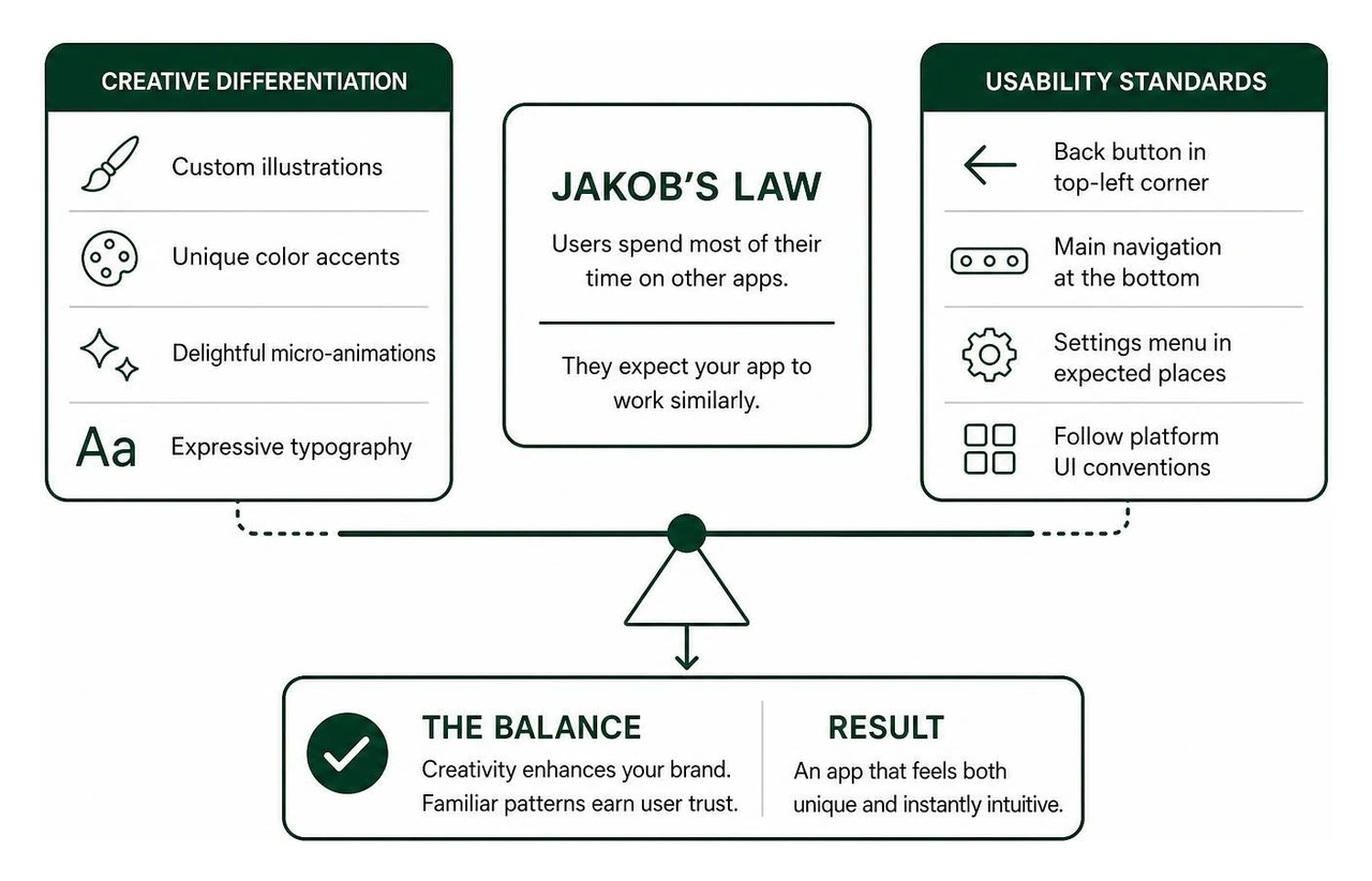
Jakob's Law states that users spend most of their time on other apps. Consequently, they expect your app to work similarly to the products they already know and use daily.
Creativity should enhance your brand's unique identity—through custom visual illustrations, unique color accents, delightful micro-animations, and expressive typography—while respecting standard platform UI navigation rules. Placing back buttons in top-left corners, main navigation at the bottom, and settings menus where users expect them ensures your app remains intuitive from the moment it is launched.
Frequently Asked Questions About Mobile UI/UX Design
How do I start designing a creative mobile app without prior experience?
Start by analyzing established user flows on real-world reference platforms. Clone free, community-vetted Figma UI kits to study how status bars, screen padding, and navigation components are structured. Utilize grid systems (like the 8-point grid) to maintain consistent layout margins, and experiment with AI design tools to rapidly explore visual design styles before refining your layouts manually.
What is the 60/30/10 rule in mobile UI design?
The 60/30/10 rule is a visual composition guideline that ensures balanced color distribution across app interfaces:
60% Dominant Color: Used for background surfaces and primary canvas layouts.
30% Secondary Color: Used for structural cards, text typography, and secondary UI containers.
10% Accent Color: Reserved for key action items, like primary call-to-action buttons, active toggles, and notification badges.
How can AI tools transition a mobile design into native code?
Modern AI design platforms generate structured layout trees linked to centralized design tokens. These systems convert visual screen elements directly into native code components for frameworks like SwiftUI, React Native, and Flutter. This code can be copied into development environments like Xcode or Android Studio, eliminating manual styling and reducing development timelines.
Transforming Your App Vision into a Market-Ready Product
Creating an exceptional mobile application requires more than just slick UI visual mockups—it demands a seamless blend of intentional design, psychological retention mechanics, and battle-tested engineering. At Synergy Labs, we specialize in transforming ambitious app concepts into scalable, market-ready digital products.
Headquartered in Miami, FL, with global touchpoints across major tech hubs—including San Francisco, Austin, New York, London, Dubai, and beyond—we offer our clients direct access to senior leadership through a hands-on, high-touch development model.
When you partner with us, you benefit from:
In-Shore CTO Leadership: Strategic guidance from experienced technology leaders who oversee your product architecture from day one.
Offshore Engineering Excellence: Highly skilled, cost-effective development teams that bring your designs to life rapidly.
Fixed-Budget Transparency: No hidden expenses, budget overruns, or unpredictable billing hours.
Milestone-Based Execution: You only pay as clear, tangible product milestones are completed and validated.
Whether you are launching a new startup product or modernizing an existing digital platform, our user-centered design philosophy and cross-platform technical expertise ensure your application stands out in crowded app store marketplaces.


.avif)

.avif)


